Using SwiftUI to Build a Mac-assed App in 2026
I recently launched the macOS version of Shopie, an app I first released on the iOS App Store late last year. Shopie helps you keep track of products you're interested in by letting you create wishlists and notifying you whenever a product's price, availability, and other details change.
Unlike my other apps, where I typically blend AppKit (or UIKit) with SwiftUI, Shopie is built entirely in SwiftUI. I wanted to keep it that way to maximize code reuse across iOS, iPadOS, and now macOS. This post explores how far SwiftUI can take you on the Mac in 2026, especially if your goal is to build an app that feels truly native to the platform. It's not meant to be an exhaustive review of SwiftUI on macOS. It's simply a collection of recipes and issues I ran into while porting Shopie, a fairly small app, and keeping it 100% SwiftUI.
If you want the TL;DR: we're not there yet.
Update after WWDC 27
I wrote a follow-up to this post after it got some unexpected attention, an engineer from Apple reached out, and a few relevant SwiftUI APIs came up.
What's a Mac-assed app?
The term "Mac-assed app" was coined by Collin Donnell and popularized by Brent Simmons and John Gruber. It describes apps that are not only native, but that also adopt the system's controls and conventions and integrate impeccably with the operating system's features.
I consider Secrets to be a Mac-assed app, and proudly so. It uses native controls and looks beautiful while doing so. It leans heavily on the menu bar, includes plenty of keyboard shortcuts, supports multiple windows, has tooltips and hover states, and adopts system technologies such as Password AutoFill, AppleScript (to control other apps), Safari app extensions, and sudden termination.
If you're a long-time Mac user, you can just feel it when an app ticks these boxes. But the popularity of Electron-based apps, and even the standard set by many first-party apps, may make this much harder for newer users to understand.
SwiftUI shortcomings on macOS
While porting Shopie to macOS, I ran into a spectrum of problems: from "this should be easier" to "this is simply not possible."
Selected states
On the Mac, selection has nuance. An item can be selected in an inactive window, selected but in a view that no longer has focus, or not selected at all and still be the current context menu target. SwiftUI handles some of this well, some of it awkwardly, and some of it not at all.
-
Inactive windows
The current HIG says inactive windows should "appear subdued and seem visually farther away than the main and key windows." Long-time Mac users know that usually means something more specific. Older versions of the HIG spelled this out explicitly: "only the controls of the key window have color."
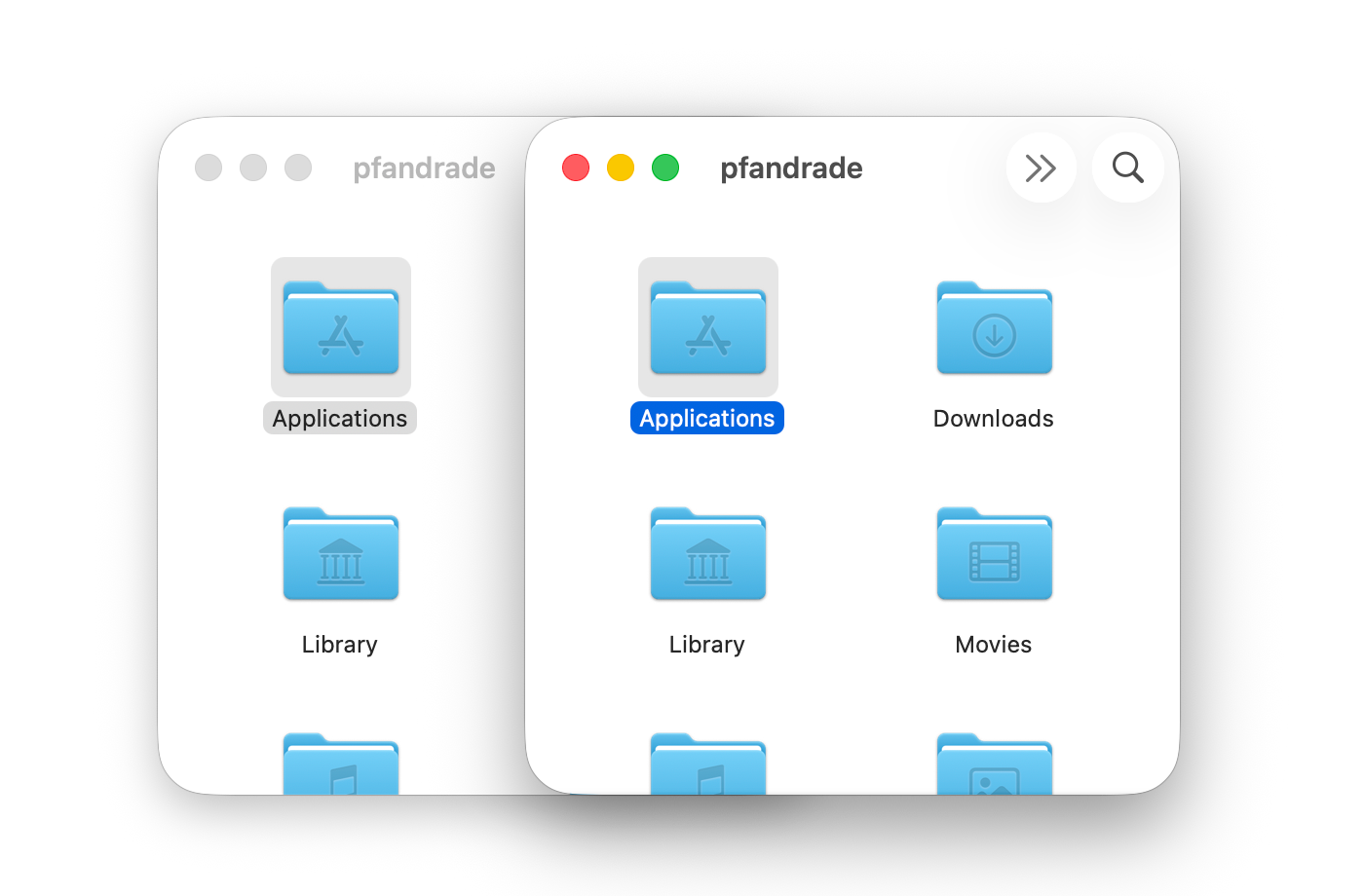
Active versus inactive windows in the Finder
Ignoring this is often the first tell that an app was made with Electron. Visual Studio Code, where I'm writing this, doesn't follow this convention.
This part is actually fine in SwiftUI. Just like in AppKit, many system controls such as
ListandButtonget it automatically, and custom controls can do the same by checking\.appearsActive↗︎. -
Selected but not focused
Next comes the case where an item is still selected, but its view is no longer focused.
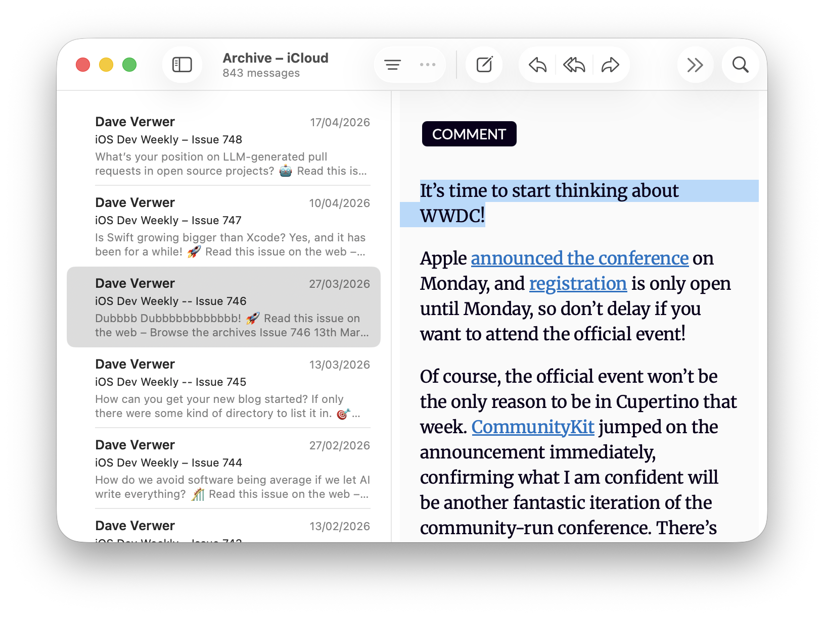
De-emphasized selection in Mail
This matters because focus tells the user which part of the UI will respond to keyboard input. In the screenshot above, an email is selected but the containing list is not focused, so pressing the arrow keys won't move that selection.
AppKit has a built-in answer here:
NSTableRowViewexposesisEmphasized↗︎, which lets you adjust the selection appearance when focus moves elsewhere.In SwiftUI, if you're building your own list with
ScrollViewandLazyVStackinstead of usingList, you can achieve the same behavior by tracking the scroll view's focus state and passing that down through the environment.ScrollView { LazyVStack { // content } } .focusable(true) .focused($isScrollViewFocused) .environment(\.isEmphasized, isScrollViewFocused)The rows can then read both
\.isEmphasizedand\.appearsActiveand adjust their selection styling accordingly. -
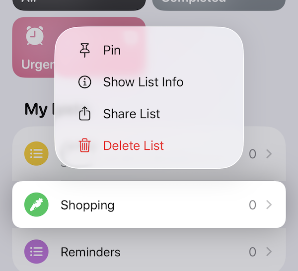
Context menu targets
The impossible case is context menus. In a proper Mac-assed app, opening a context menu should enable a focus ring around the item the menu applies to, even when that item isn't selected.
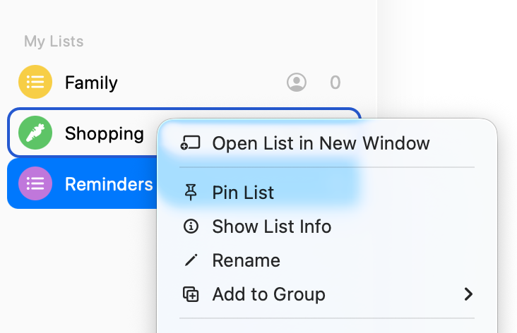
Context menu target versus selection in Reminders on macOS
In the screenshot above, the menu applies to the "Shopping" list even though "Reminders" is still selected, and the UI makes that distinction clear.
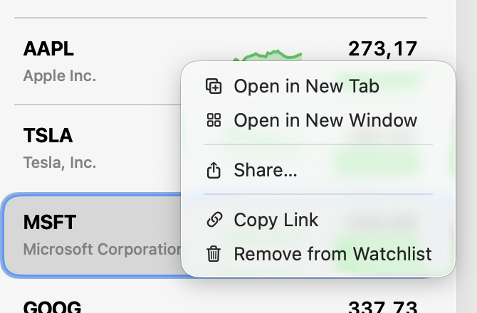
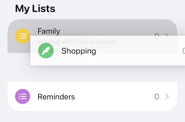
Context menu target versus selection in Stocks on macOS
In Stocks, for example, the menu applies to "AAPL" rather than the currently selected "MSFT" stock, but the interface doesn't communicate that.
The Notes app goes a step further in the wrong direction: right-clicking an unselected note immediately changes the selection. That is very much not a Mac-assed behavior 😪.
Reminders, Notes, and Stocks are all SwiftUI apps on macOS, yet each behaves differently. Reminders only gets this right because it's using
List, which inherits the behavior fromNSTableView.Step outside
List, though, and you're stuck. More than five years in, SwiftUI still gives you no way to know whether a context menu is open. And if you can't know that, you can't adjust your UI accordingly.My guess is that this fell through the cracks because it barely matters on iOS, where the system automatically elevates the relevant element when a context menu appears.
Context menus on iOS
On macOS, though, the omission feels glaring. It's also a telling sign of how much the Mac seems to matter inside Apple these days.
Before moving on, it's worth calling out SwiftUI's List. You may have noticed that it gives you almost all of the behavior above for free.
The catch is that List is incredibly hard to customize. Simply changing the selection color with .listRowBackground() ↗︎ can break the selection fade-out animation, and there's no way to customize the built-in context menu focus ring at all.
But it doesn't have to be this way. If you're familiar with UITableViewCell, UICollectionViewCell, or NSTableRowView, you might also wonder why List doesn't simply pass values like \.isHighlighted, \.isSelected, and \.isEmphasized down to its rows. It would become dramatically more useful.
Drag & Drop
Drag and drop is a staple of the Mac experience. It is one of those interactions that makes the platform feel direct and tactile: drag a file into an app, reorder a list, drop a tab into a new window, drag an image into a text field. So it's a little unnerving that SwiftUI still feels unsettled here.
In fact, SwiftUI has already gone through three drag-and-drop eras. It started with onDrag(_:) ↗︎ and onDrop(...) ↗︎, an API built around NSItemProvider.
Then, in iOS 16 and macOS 13, Apple introduced Transferable in place of NSItemProvider, along with the new draggable(_:) ↗︎ and dropDestination(for:action:isTargeted:) ↗︎ APIs.
Finally, iOS 26 and macOS 26 introduced a third iteration: a new dropDestination(for:isEnabled:action:) ↗︎ overload that takes a DropSession, plus new container-based drag APIs for multi-item drags.
But the problem with all three is that you have no visibility into the drag session unless you are the drop target. When you start dragging a UI element, you may want to dim it, or even remove it from the interface while the drag is in progress. You can find examples of both behaviors on iOS.
Dragging a list in Reminders on iOS removes it while being dragged
But this is impossible to do correctly in SwiftUI. You might be tempted to use .onDrag() to dim the view, but if the user drops the item outside your window, you have no way of knowing that happened, leaving your item stuck in a dimmed state.
By contrast, AppKit's NSDraggingSource ↗︎ gives you all the information you need from the start. Why SwiftUI still doesn't is beyond me.
Keyboard Shortcuts
You can often tell a Mac power user from a regular user by how much they lean on the keyboard. They don't just use ⌘C and ⌘V. They navigate lists with the arrow keys, jump between panes, trigger commands from menus without touching the mouse, and generally expect the app to keep up.
SwiftUI can support this, but it still feels more cumbersome than it should. A good example is the arrow keys. On macOS, you're supposed to use .onMoveCommand↗︎. But it's still unavailable on iOS, even though iPad apps are routinely used with hardware keyboards that also have arrow keys 🤷.
So you end up writing one code path for macOS and another for iPadOS for what is, conceptually, the exact same user interaction. That kind of platform split makes SwiftUI feel less like the unified UI framework it was promised to be.
Things get worse once a TextField has focus. At that point it happily gobbles up keyboard events and gives you very little room to participate. A good example is search. Spotlight lets you keep typing in the search field while also using the up and down arrow keys to move through the results. That's a completely standard Mac interaction, and I've had it in Secrets since its first release 10 years ago. Alas, it's currently not possible in pure SwiftUI.
Once again, the issue isn't that keyboard support is impossible in SwiftUI. It's that the framework gives you just enough to cover the simple cases, then gets in your way the moment you try to match what Mac apps have done for decades.
Window Toolbar Items
Toolbars are another area where SwiftUI feels much more comfortable on iPhone and iPad than on the Mac. On macOS, toolbar layout matters. Users build muscle memory around where actions live and which items belong to the sidebar versus the detail view.
That gets especially awkward in a three-pane split view. SwiftUI asks you to describe toolbar items semantically, using placements such as .primaryAction, .secondaryAction, and .navigation. That sounds nice in theory, but in practice those placements mean different things on each platform, and even on macOS it can be hard to predict where an item will actually end up.
To make matters worse, the toolbar is effectively assembled for you by collecting .toolbar modifiers from across the view hierarchy. That is convenient for simple screens, but it can feel maddening once you need precision. Instead of designing one coherent Mac toolbar, you often end up negotiating with SwiftUI's interpretation of your hierarchy and hoping the final arrangement matches what you had in mind.
Once again, the problem is not that SwiftUI makes toolbars impossible. It's that the framework abstracts away exactly the bits that matter when you're trying to make a Mac app feel deliberate.
The Decline of Mac-assed Apps
There was a time when Mac apps felt unapologetically Mac. Panic, Omni, Cultured Code, Bare Bones, Sofa. The years just before the iPhone SDK were probably peak Mac-assedness. Then Apple's center of gravity shifted toward the iPhone.
Now we have Electron, Catalyst, and iPadOS apps on the Mac. And even Apple's SwiftUI apps often sand off the very behaviors that made Mac software feel great in the first place.
Looking through past Apple Design Awards, Agenda in 2018 may well have been the last truly Mac-assed winner. That feels revealing.
Apple dropped the ball here. AppKit was ahead of its time and UIKit was a more polished version of AppKit. A serious cross-platform framework that unified the two should have happened long before SwiftUI. Instead, Apple left AppKit to fossilize and then tried to leapfrog the problem.
You can see the result everywhere. SwiftUI is productive, modern, and often delightful, right up until you try to make a really good Mac app. Then suddenly you're fighting the framework for things the Mac solved 20 years ago.